Case study · Fitness
Gigafit Pro
Client — Gigafit ProYear — 2023
NamingBrand FoundationPackaging DesignContent Design
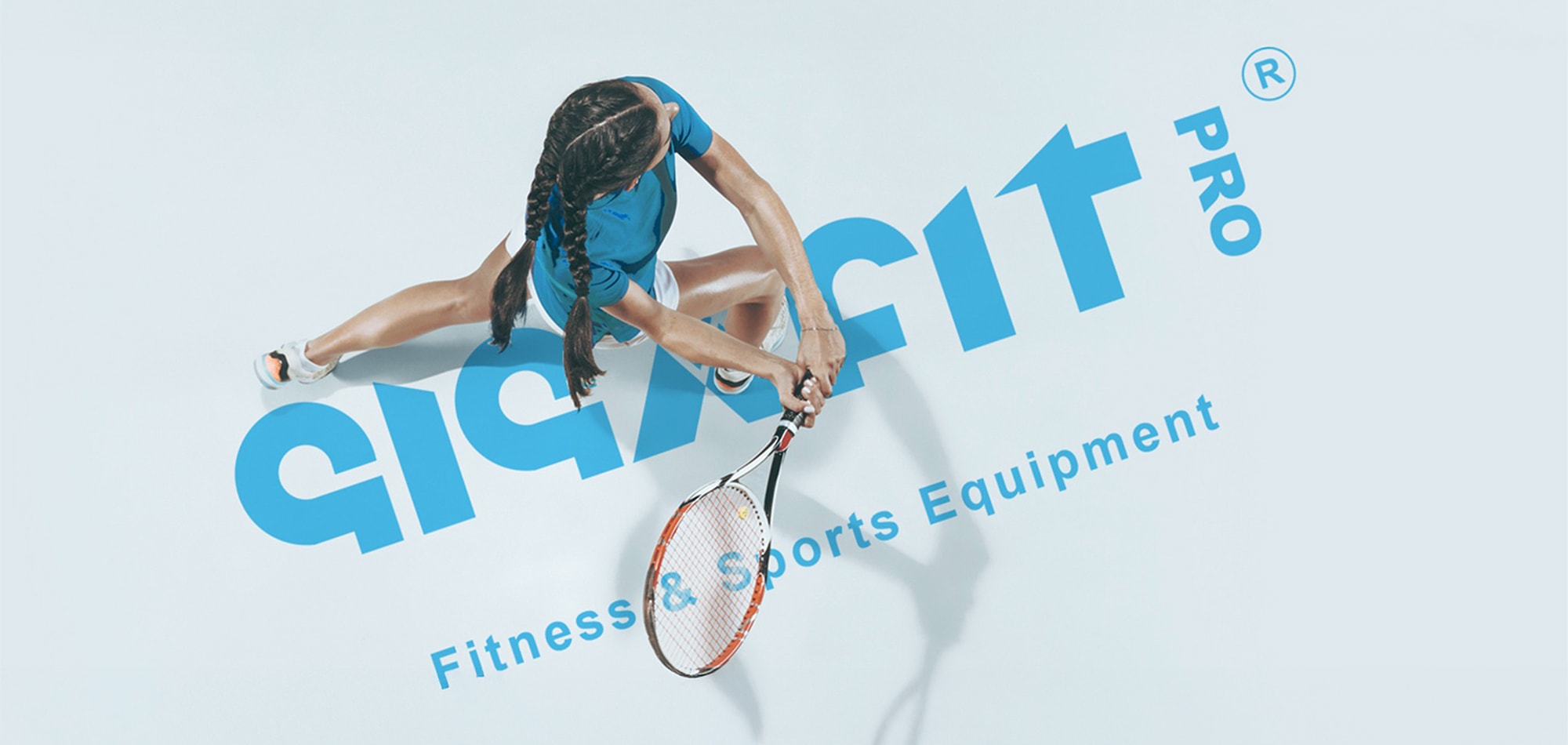
Gigafit Pro had the product expertise and industry connections to compete in Kenya's gym equipment market — but no brand, and no way to signal it was the premium choice from day one.
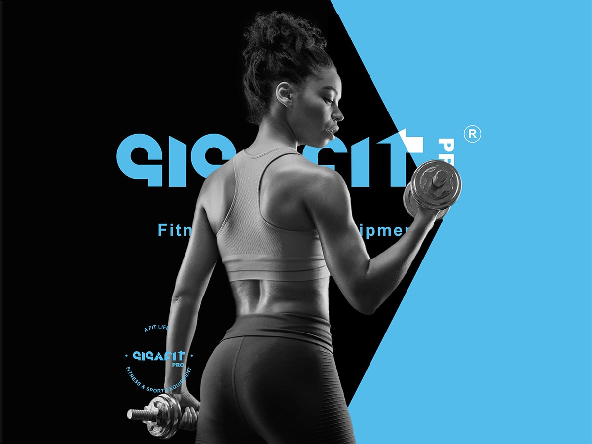
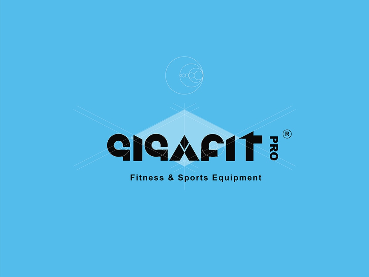
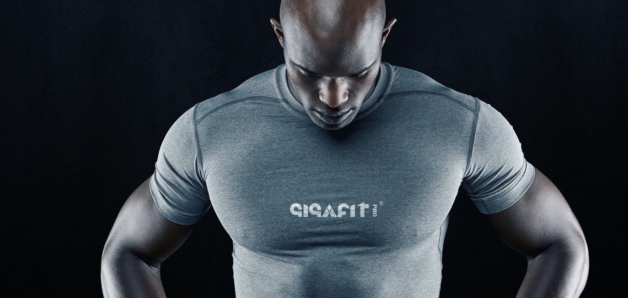
We built the identity from zero, starting with a bold, muscular logotype that had the weight and movement of a clean-and-jerk. An electric-blue-and-black palette carried that energy through every touchpoint, from showroom signage to equipment badges.
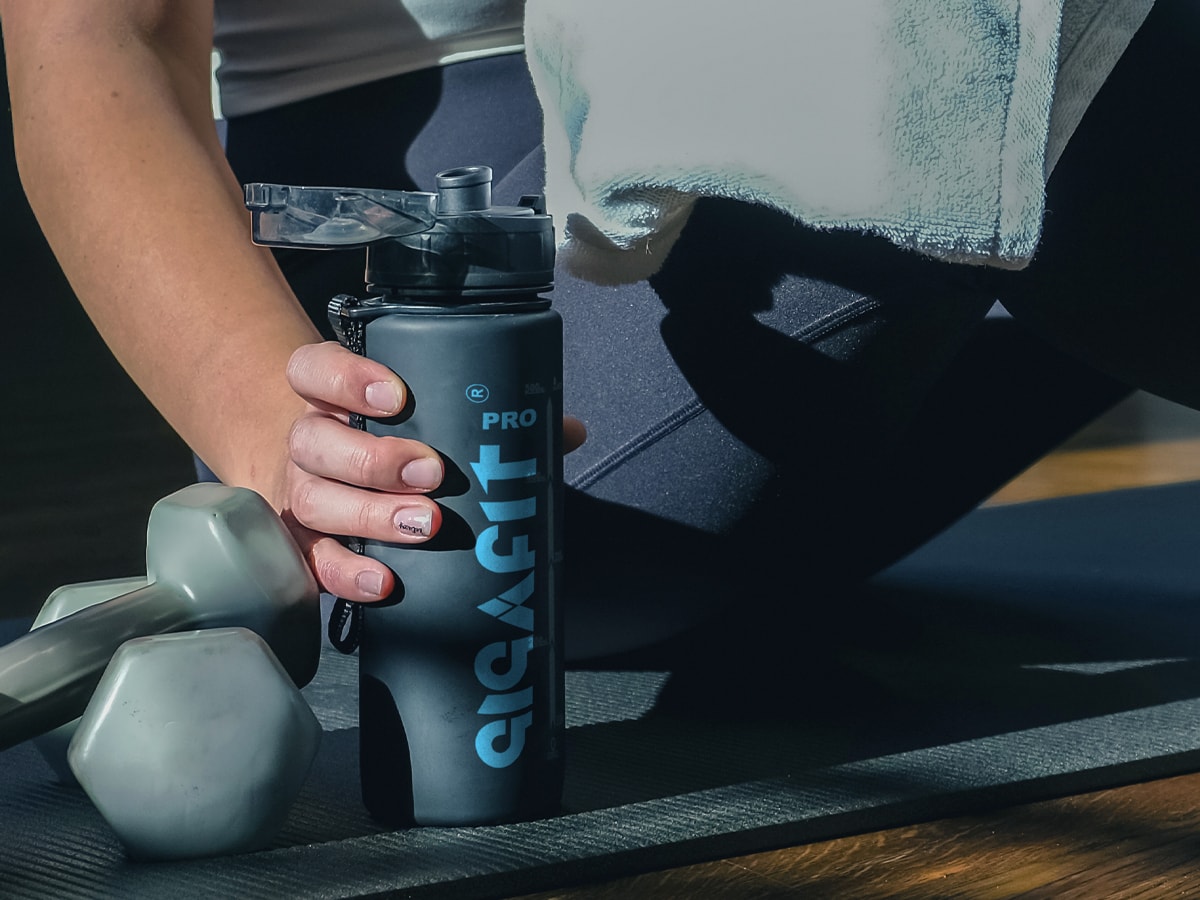
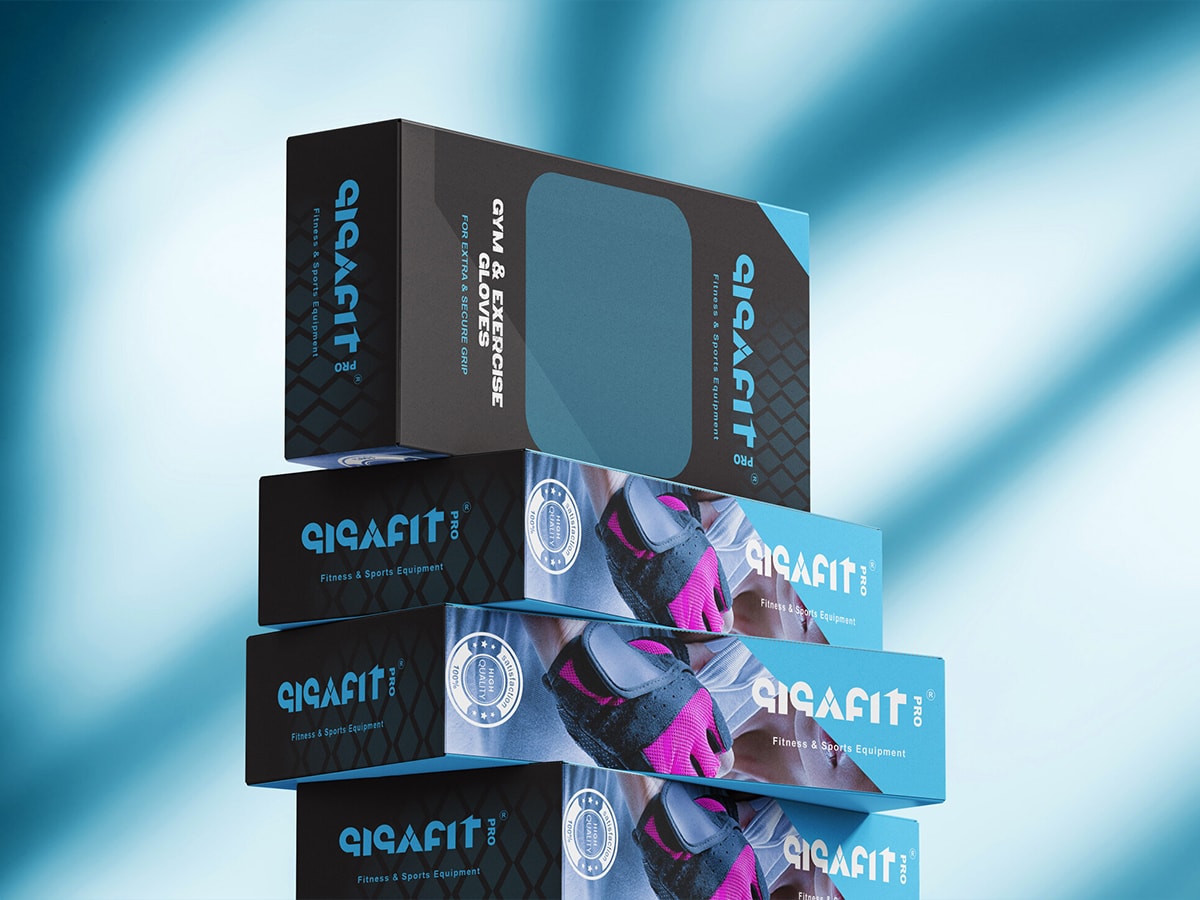
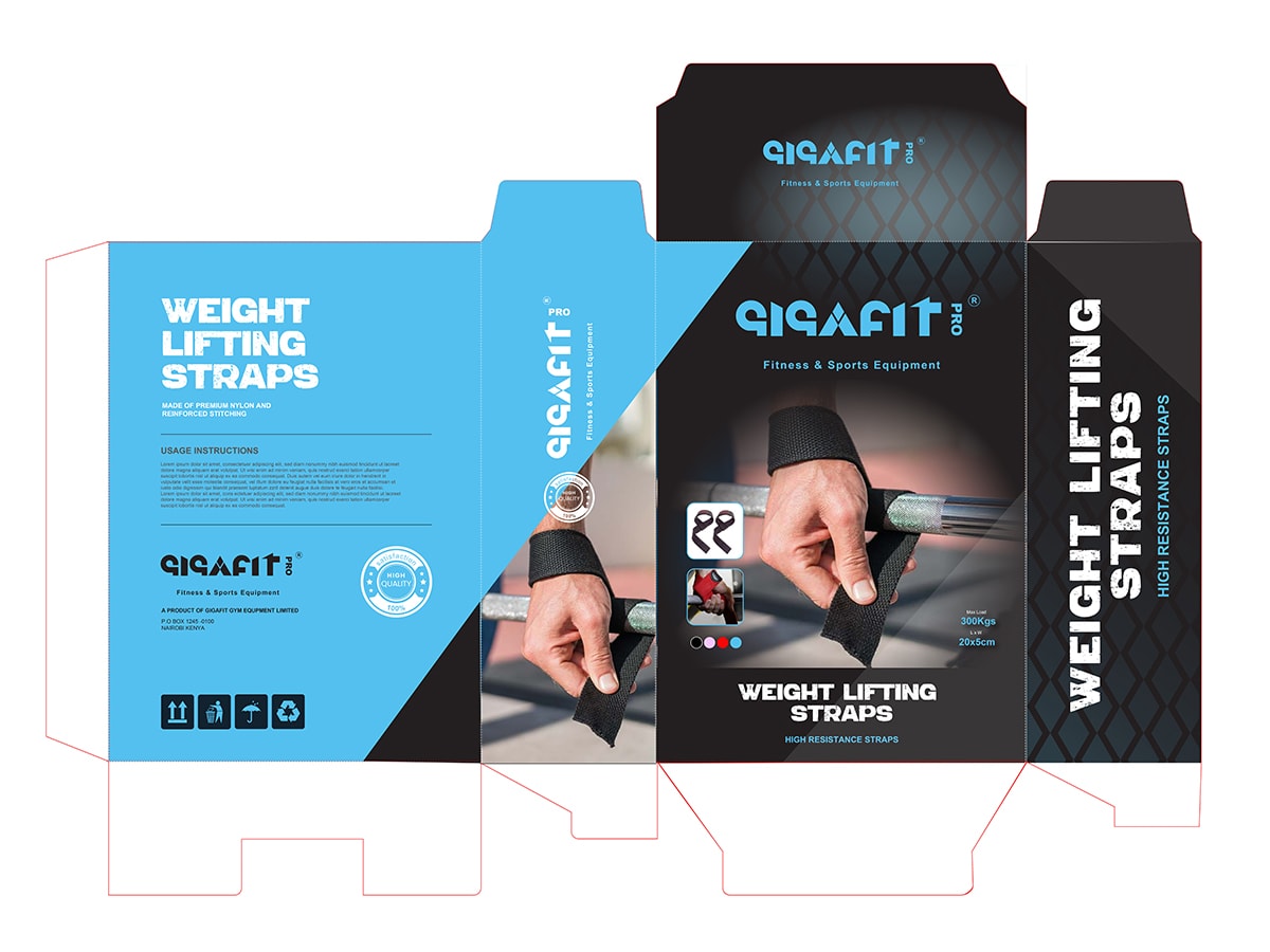
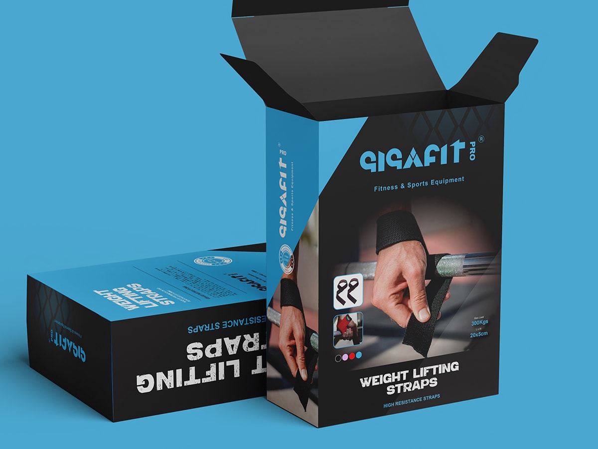
The packaging system became the brand's quiet advantage — a signature blue diamond that turned shaker boxes and treadmill crates alike into an unmistakable first touchpoint, so Gigafit Pro read as a category leader before a single showroom door opened.
Next case
Ionix Paints